Building a design system for a government · 7 min read
Building a government's
design system
A consistent and unified language for the online interactions between uruguayan citizens and the state dependencies.
Introduction
Client
The uruguayan government needed a consistent and unified language for the online interactions between the citizens and the state dependencies.
Challenge
This was a project that took many years, many iterations and many tries. Making something this big, and doing it in the public sector, requires a lot of patience, hard work and motivation.
Project
It's hard to set a starting date because there were a lot of pauses and fresh starts, but I can say that when I joined Concreta (the company who provided digital design services to the government) in 2012 the idea was already being talked about. The project had many steps and iterations, to the point that it's still a work in progress up to this day (I havent work on it since 2019).
At the beginning we didn't have every dependency's support, but many of them join the project along the way. It became a huge deal and now you can see most of, if not all, the big state dependencies have joined.
The project has the goal of reaching 100% of the Central Administration sites, of which more than 90% have been migrated.
Quote taken from the official project's site.
We designed a few slides to present the idea to the different stakeholders involved in the project. We tried to innovate by printing them in A2 format and presenting them with something tangible.
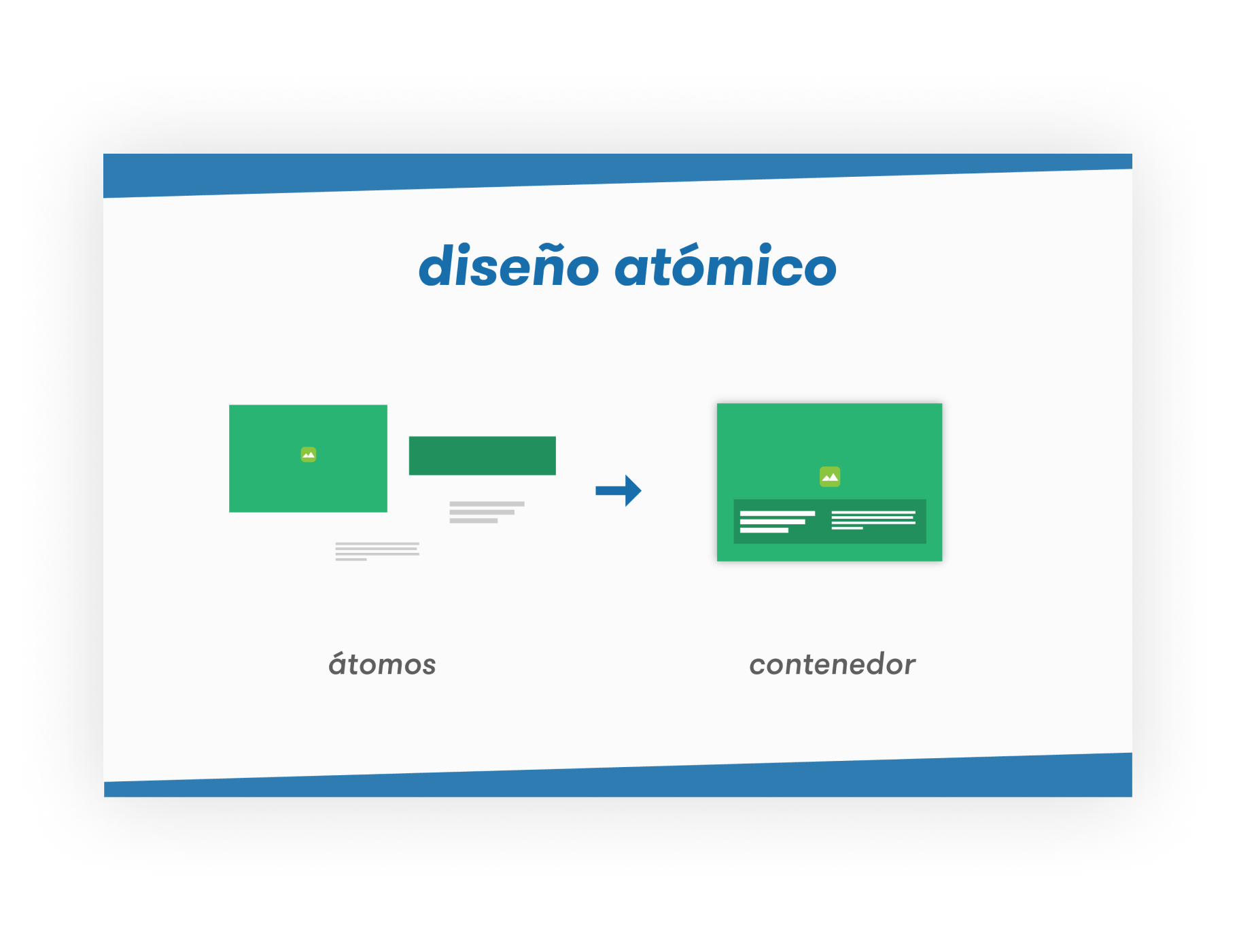
Slide to comunicate the concept of atomic design.

Showing how the pages were going to be built.
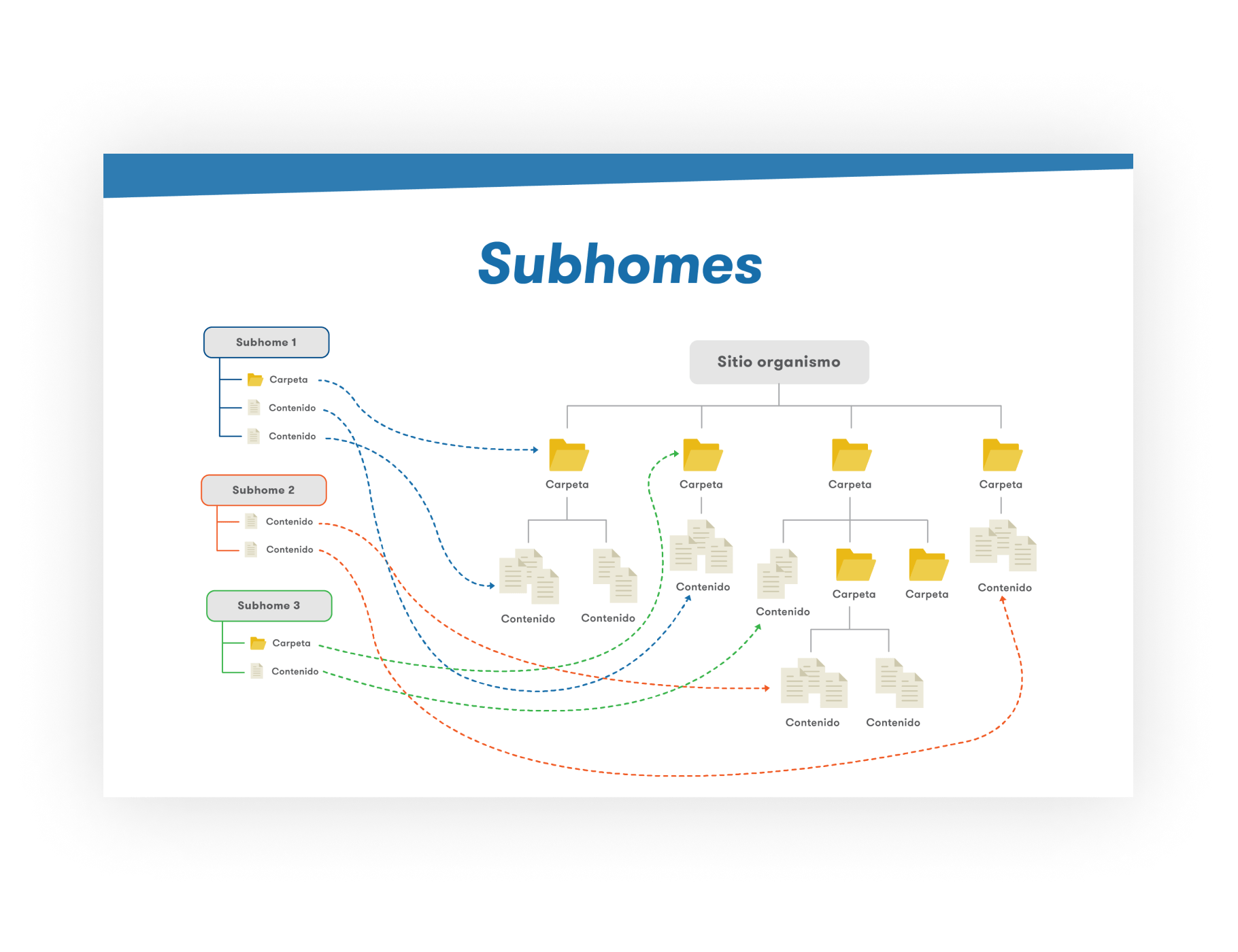
Explaining the information architecture proposal.
1. The concept
Creating a common digital language for all the interactions with the government
As we worked with many different state dependencies, we saw that users had to learn each dependency's patterns and language for every procedure they needed to do. So we proposed to unify languages and create a similar experience as to what the UK government achieved with their digital transformation.
Because this was a government language/system, it had to be intuitive, usable and accesible, so that it could be used by a large user base composed of all of Uruguay's citizens (well, mainly from people from 12 to 80 years old). Also, It had to be fully responsive, a concept that wasn't too spread out between the dependencies at that moment.
2. Components
Designing a great library of components to cater every need
We worked a lot on atoms, molecules and organisms (terms used by Brad Frost in his Atomic Design Methodology), as the way to create the componentsthat we would reuse to build the entire system.
We ended up creating many variants for a lot of the components so that we could meet the dependecies' requirements but without compromising the design system.
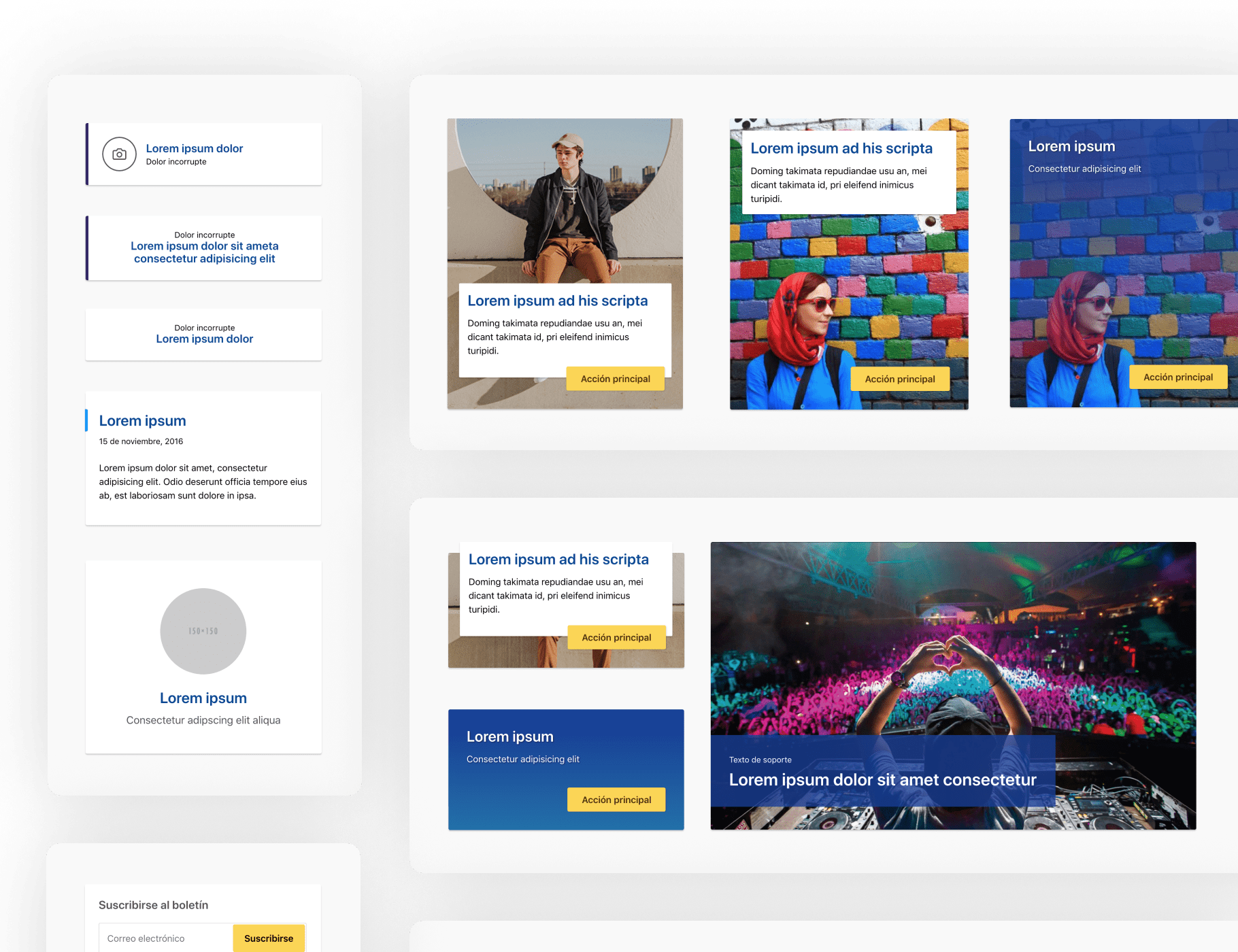
These are differet components for links and featured links.
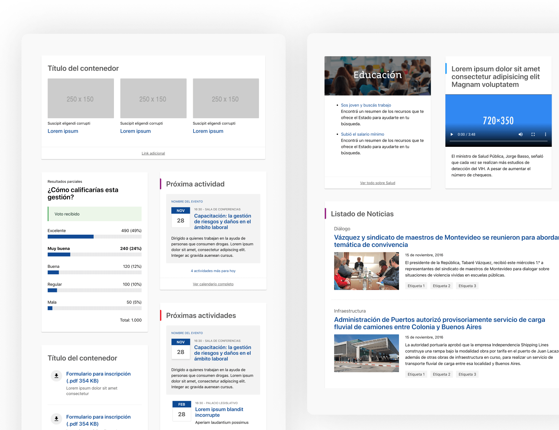
On the left, different kinds of lists. On the right, a few ways of showing news.
3. Page templates
Building page templates for particular and specific use cases
We also created page templates. This templates were created mainly as guides for how to use and combine the components we had designed.
But, as time went by, they started asking us for templates for special use cases. You can't imagine the amount of special cases there are, but we tried to reuse components and templates as much as we could.
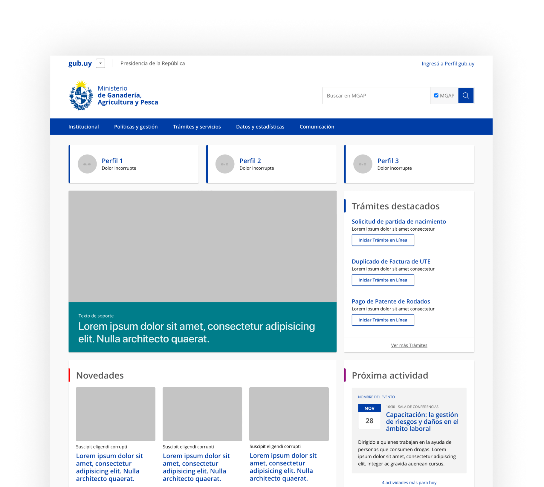
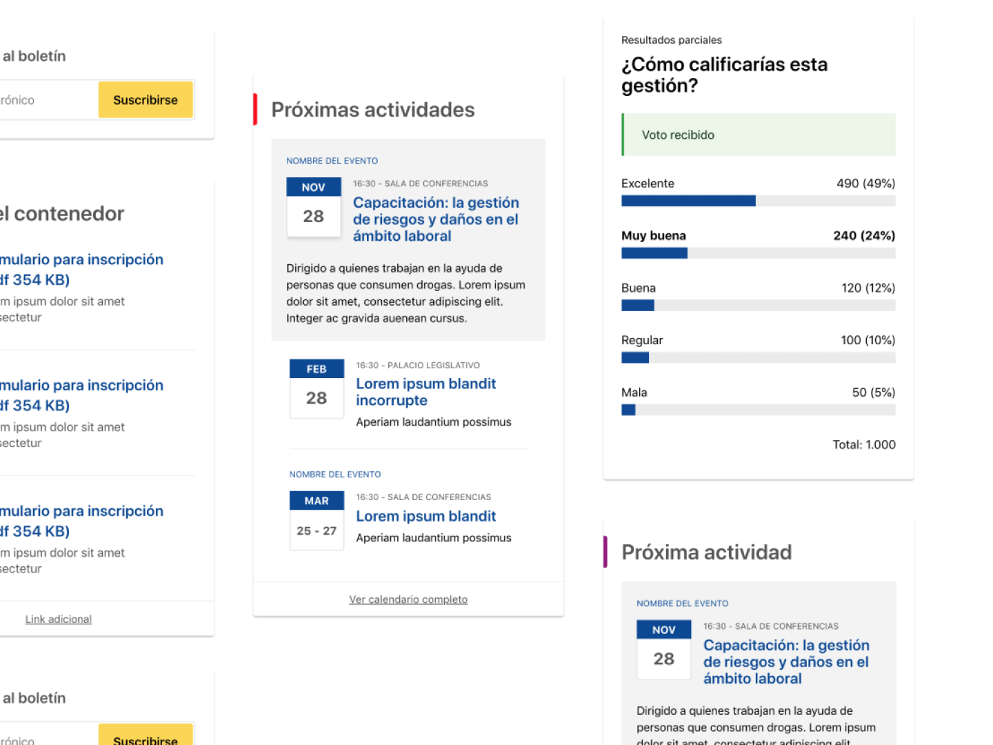
A homepage template using lists, calendar and link components
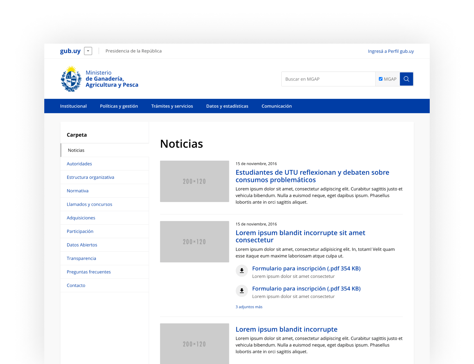
Example of a list page template
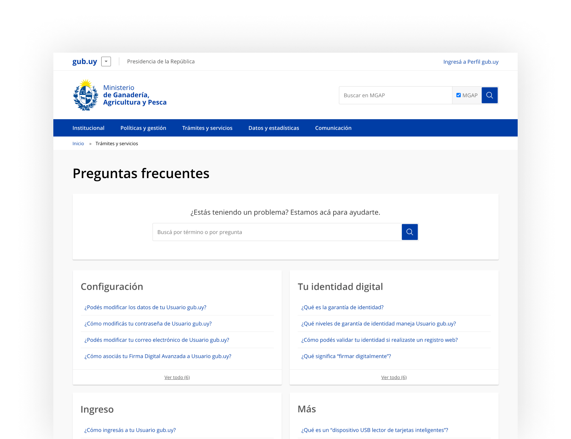
Fequently asked questions template
4. Forms
Putting an emphasis on the tool that citizens use the most
Beside designing components and templates for the institutional websites, we focused a lot on forms. These are the tools through which the users mostly interact with the state.
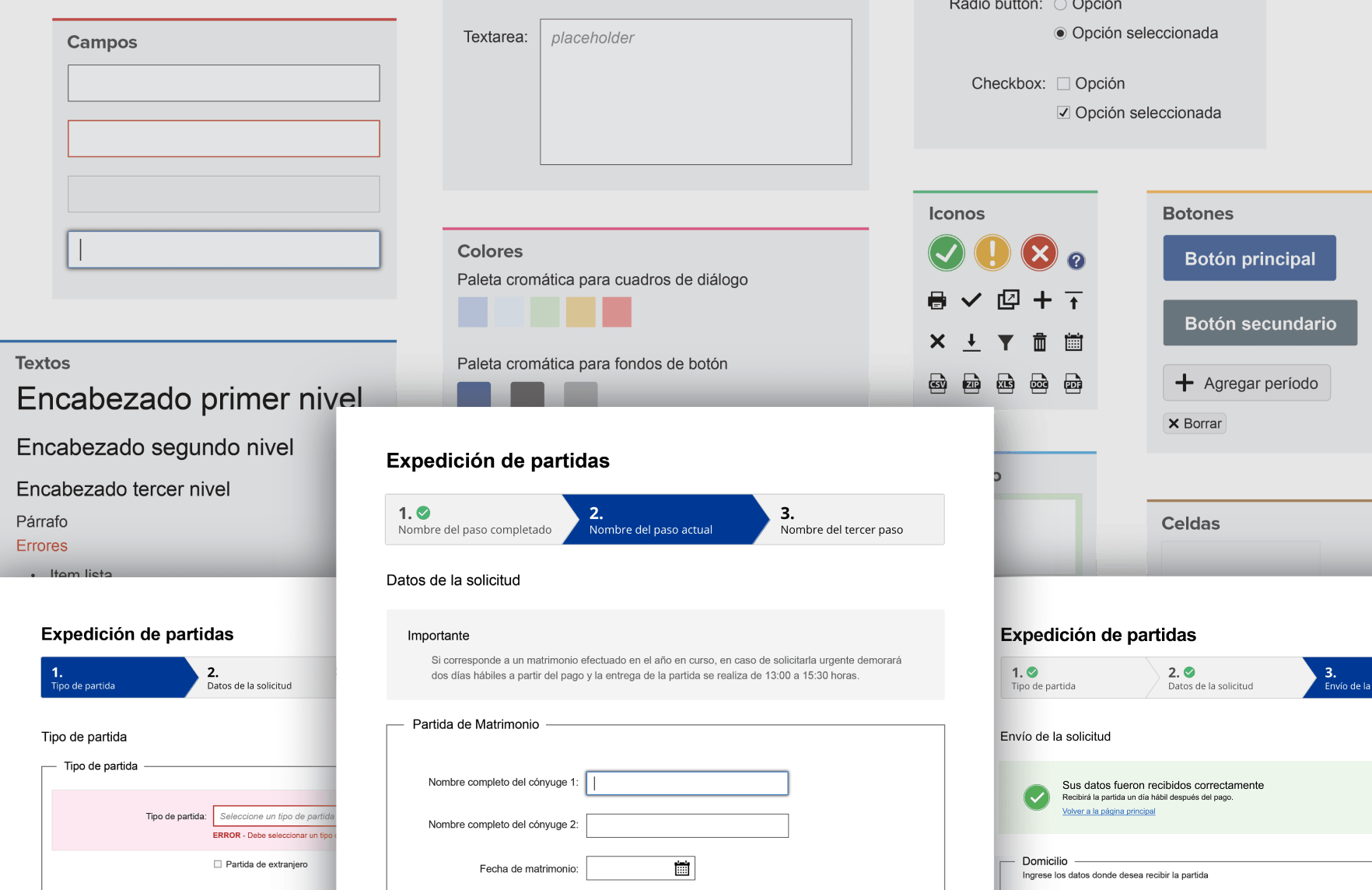
We spent a lot of time on the forms. We had to review A LOT of different types of forms to know what kind of information was asked and how. Based on that, we design a flow that could work for the majority of cases. We encountered a couple of special cases along the way, for which we generated modified components or built some new ones.
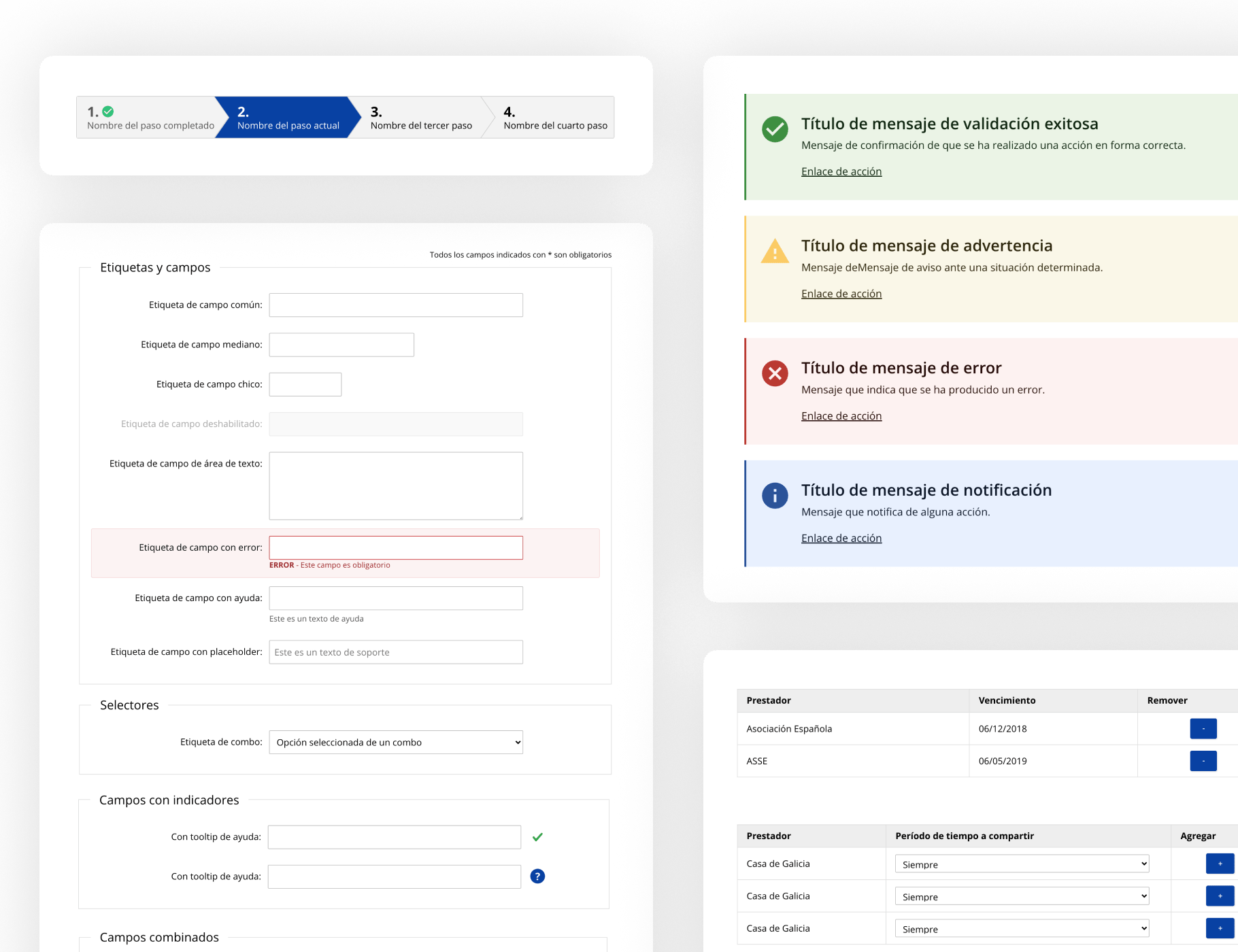
A few of the form components.
5. Styleguide
Defining the styles with accessibility and usability in mind
Accessibility and usability were our main goals with this design system, so the styles should reflected that. That is why our designs had an AAA level of conformance (WCAG explanation) with the accessibility success criterias. We focused on contrast, sizes and hierarchy.
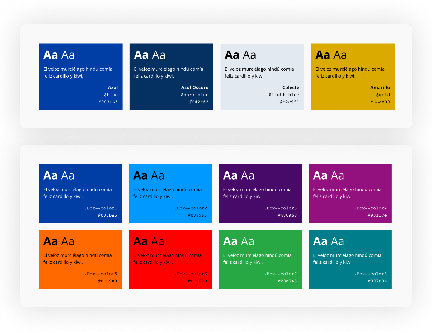
On top the primary colors, below a big list of complementary colors.
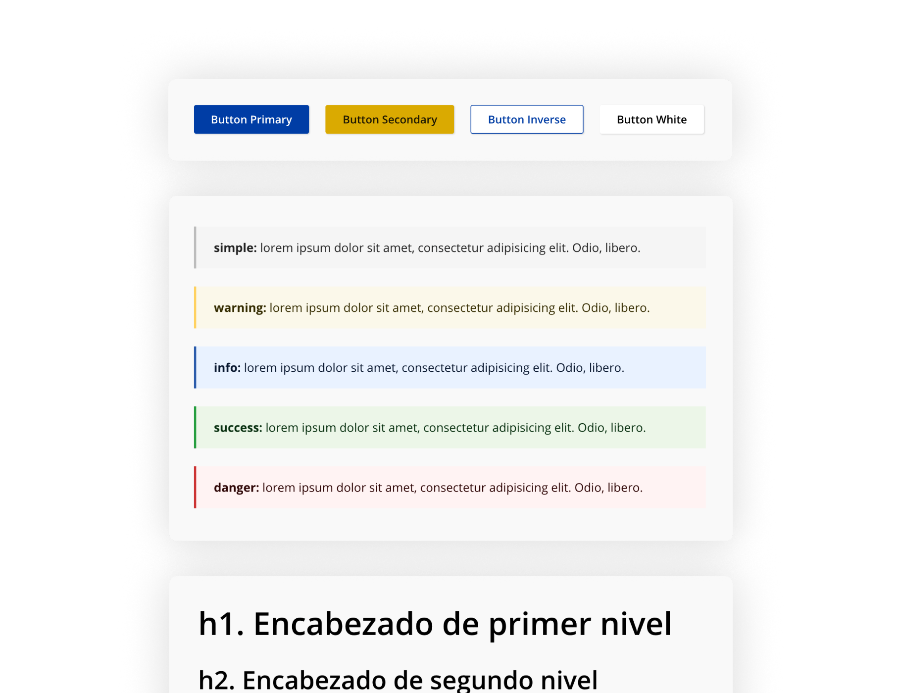
Buttons, warnings and headers.