A new Mobile First shopping experience · 4 min read
A new mobile first
shopping experience
Devoto, one of the largest supermarket chains in Uruguay, was looking for a redesign of his e-commerce site.
Introduction
Client
Devoto, one of the largest supermarket chains in Uruguay, was looking for a redesign of his e-commerce site.
Challenge
We needed to deliver a great shopping experience for mobile devices, so we decided to follow the idea of Mobile First.
Roles and tasks
In this project I had several roles: I was the front-end developer of the site, participated in the design of various interface components, and designed the home page for the desktop.
1. The concept
Redesigning the whole buying experience with Mobile First in mind

Since the very beginning, we decided that we were going to focus on mobile. We had traffic numbers that supported this idea. We even decided that mobile should have alocated 80% of our time and the remaining 20% for desktop. We were aiming to achieve a great mobile buying experience, so that the user could shop from anywhere: bus, waiting in lines, lying in the couch or anytime when there isn't a computer nearby.
2. The finding
Figuring out what to do with the shopping cart was a challenge
The finding that stands out the most among the interface components is the design of the mobile shopping cart. The design solution allows the cart to be present and easily accessible throughout the purchase process but without being a hassle.

The cart in its colapsed state
The cart, when colapsed, has a fixed position on the bottom of the screen and shows the amount of products you have added and the total cost. The Buy button leads you to the checkout. You can smoothly unfold the cart by dragging up from center tab or you can just press on the tab and it will automatically go up.

The cart in its unfolded state
When the user opens the cart, it fixes on the top of the screen and you can see the list of products inside it. You can interact with the products (add quantity, delete, etc.) in the same way as if you were in the listings page.
3. The app
Giving the frecuent customers an extended and tailored buying experience
As part of the complete experience redesign, we also designed an app targeted to frecuent customers of the supermarket.

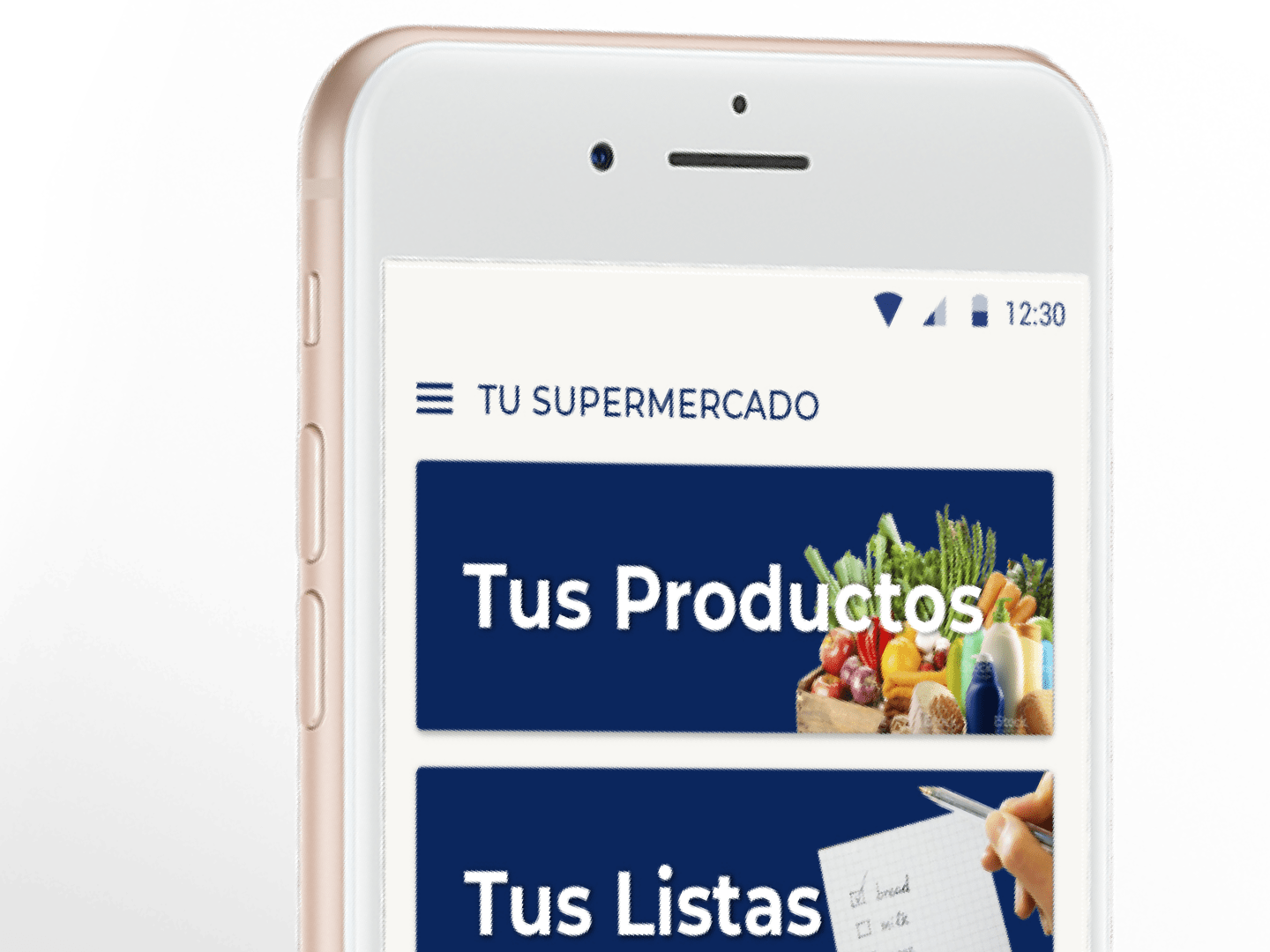
The app's home screen

The app's side menu
The app automatically created buying lists based on your last purchases and you could also "curate" a list of your favorite products, so that the lists would be even more accurate.

You could keep or discard the automatically created lists

To unify the experience, the products' card were the same as in the web
The app also tried to make your life easier by suggesting weekly food menus based on your purchases. It not only suggested you the plates but it also gave you the recipes.

The list of posible recipes based on the products you bought

One of the recipes in detail
4. Desktop
Creating an attractive desktop homepage that showcases the product variety
Due to client a request, but as part of the 20% of time dedicated to desktop, I redesign the home page to have a greater visual impact.

I grouped the product categories into large blocks, each with an illustrative image and a big color title (matching the predominant color of the illustrative image), allowing the menu / navigation to be presented in a more attractive format.

This design solution also solved another of the client's requirements: to transmit the great variety of products that the supermarket has.